Controls are added to script pages and are used for a variety of functions, for example: to collect information, carry out activities (ie, run code, interrogate databases, etc), display data and schedule tasks. Controls are added to script pages from the Control List in the Script Editor.
Where you wish to use the same control , or display the same information to an agent more than once without saving multiple values, controls that already exist somewhere in your script may be displayed again by selecting from the Used Controls list.
The controls described in this user guide are those that are shipped with the latest version of the CallScripter application by default, so can vary depending on which version is being used, as well as any controls imported or exported from other versions. Some older controls are documented in the Legacy Features section of this guide. New controls can be written if required, please contact the CallScripter Professional Services team for further information.
Updating Controls
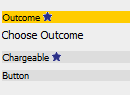
When CallScripter is upgraded newer versions of controls may have been released. When an existing script, or template utilises an old control, a blue star icon will appear next to the control name:
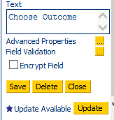
Where the blue star icon appears, click on the control to view its attributes. At the foot of the control attributes, an Update button will be shown:
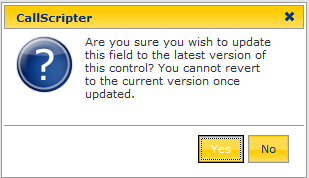
A warning box will appear. Click Yes to update the script to use the latest version of the control. Any new features relating to that control will be available within the script attributes:
Controls or Fields?
Whilst the terms "Control" and "Field" are used interchangeably, generally speaking, a control is something added to a script page from the Control List. Once a control has been added to a script page it is often referred to as a field.
Generic Control Attributes
Some controls use generic attributes, these are described below rather than on every page in which they feature:
Field Name - the control name displayed in a report (if one is written), or used to refer to this control in code. Spaces are allowed, but special characters should be avoided for versions pre-4.5.29. If Field Name is amended and already used in a report, the report will be need to be amended to account for this). When more than one control of the same type is placed on a script page the control will be suffixed with a number, for example, Text Label, Text Label_1, Text Label_2, etc. In versions 4.5.33+ the Field ID is used instead of a sequential number.
-
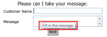
Field Help - the text entered into field help appears to the agent as a tool tip when they hover over the field:
-
Styling - change foreground, background, border, size and font settings for individual elements of that control. For more details, see
Field Styling.
-
Text Attributes - the Text attribute of a control refers to the text that the agent will see. HTML tags can be used in field labels.
-
Advanced Properties - This button links to specific control attributes.
-
Delete - The delete button at the foot of the control attribute is used to delete the selected control.
-
Save - The save button at the foot of the control attribute is used to save the selected control.
-
Close - The close button at the foot of the control attribute is used to close the attributes of the selected control and return to the Control List.
-
Field Validation - launches the field validation attributes of the control. For more information see
Field Validation
Control Styling
Controls each have different attributes that can be styled. Many controls that gather information from the Agent, have four component parts, e.g., list boxes, radio buttons, text boxes, text areas, each of which can be styled. The styling options that come up are generic and may not apply to the control element
-
Text The text part of the control is the label that the agent will see. The text itself can have colour, weight, background colour, border amongst other attributes. It sits within the left cell of the control (3), which has its own styling attributes.
-
Input This relates to the field the agent will type information into. It sits within the right cell of the control (4), which has its own styling attributes.
-
Left Cell The left cell is the portion of the control which the text (1) sits on top of.
-
Right Cell The right cell is any space to the right of the control cell that contains the
Each of these areas of the controls can have the following attributes:
· Font Name (arial, tahoma, verdana)
· Font Size (point)
· Font Weight (normal, bold, bolder, lighter)
· Border width (pixels)
· Border colour (accepts text values and hex, e.g., red, or #ff000)
· Border Type (solid, double, grooved, dotted, dashed, inset, outset, ridged, hidden)
· Background Colour (accepts text values and hex, e.g., red, or #ff000)
· Foreground Colour (accepts text values and hex, e.g., red, or #ff000)
· Width (pixels)
· Height (pixels)
· Text Align (left, centre, right)